
Jun 11, 2022 | Fix Website
Do you need to update your website?
Your website is your company’s face to the world, and it needs to be up-to-date and looking its best at all times. But how do you know when it’s time for a redesign? In this article, we’ll go over some key signs that indicate it might be time to give your website a refresh.
How often should you update your website?
The answer to this question depends on various factors, such as the nature of your website, the frequency of updates, and your budget.
If your website is a static site with little or no changes, then you may only need to update it once a year or less. On the other hand, if your website is constantly changing and adding new content, then you may need to update it more frequently, such as every month or two.
It’s also important to consider your budget when deciding how often to update your website. If you can’t afford to update your site very often, then you’ll need to be strategic about when you do make changes. For example, you might want to focus on making major changes or adding new features during slow periods, so that you don’t have to spend as much money on updates.
Why is it important to update your website regularly?
Your website is one of your most important marketing tools, so it’s important to keep it up-to-date with fresh content. Regular updates show that you’re active and engaged with your audience, and it can also help to improve your search engine ranking. Adding a blog is a great way to keep your website updated regularly, and it’s an easy way to add fresh, relevant content.
What happens if you don’t update your website?
If you don’t keep your website up-to-date, you could be missing out on valuable opportunities for your business. Your website is often the first impression that potential customers will have of your company, so it’s important to make sure that it reflects your brand well. An outdated website can give the impression that your business is out-of-touch or not very professional.
If you’re not sure how to update your website or don’t have the time, consider hiring a web designer or developer to help you. Even small changes can make a big difference in how your website looks and functions.
How to update your website
If you’re reading this, then it’s likely that you already have a website that’s in need of an update. Whether it’s because your website is starting to look dated or you’re simply not getting the results you want from it, making some changes can be a great way to give your online presence a boost. But what exactly should you do to update your website? Here are four suggestions:
1. Give your website a new look
One of the easiest ways to make your website look more modern is to simply change up its appearance. This could mean anything from choosing a new color scheme to completely redesigning your site’s layout. If you’re not sure where to start, there are plenty of resources (including our very own TemplateMonster blog) that can give you inspiration for giving your website a fresh look.
2. Add new features and functionality
Another way to update your website is to add new features and functionality that didn’t exist before. This could be something as simple as adding a contact form or social media buttons, or something more complex like an ecommerce system or a custom content management system. If you’re not sure what sorts of features would be most useful for your site, try surveying your
Conclusion
If you’re asking yourself whether you need to update your website, the answer is most likely yes. A website that is outdated can give off the wrong impression to potential customers, and it can also be difficult to navigate and use. If you’re not sure where to start, our team of experts can help you create a beautiful and modern website that will help your business succeed. Contact us today to get started.
Jun 6, 2022 | Fallon CC Communications
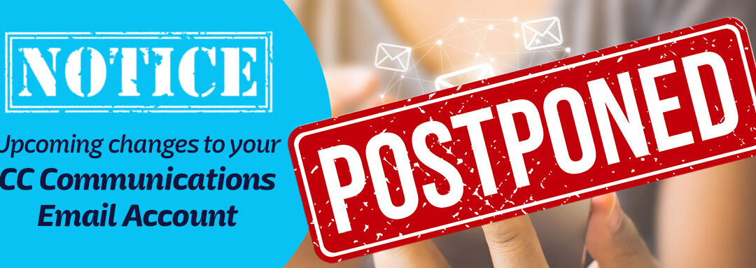
CC Communications Web Design Closing
As of June 2022 CC Communications will no longer be providing web design services. We want to thank all of our past clients for their business, and we wish them all the best in the future.
Although CC Communications, does not personally reccomend any one web design company, they have shared a list of local web design and hosting providers who are ready to help you in this process. Churchill County Nevada continues to grow. Opportunities for business exspansion are available for entrepreneurs in Northern Nevada.

Sandy Rowley, is a 23 year web design business located in downtown Reno Nevada. She provides website design, website updates, hosting and email services. You can call, email or text Sandy and her team at 775-870-0488.
They are on standbye and ready to help ease the stress and confussion.

CC Communications is closing its web design division.
We’re sorry to announce that CC Communications is closing its web design division. We want to thank all of our amazing customers for their support over the years. We hope to continue serving you in other ways. Thank you!
What this means for current and future clients.
This decision was not made lightly, but we feel it is in the best interest of our company and our clients. We want to assure you that all current projects will be completed and all client commitments will be honored. If you have any questions or concerns, please do not hesitate to contact us.
CC Media is still offering the following services:
Services
Telephone
What this means for current and future clients.
We want to thank all of our clients for their business over the years. We have enjoyed working with you and helping you grow your online presence.
This decision was not made lightly, but we feel it is in the best interest of our company and our clients. We want to assure you that all current projects will be completed and all client commitments will be honored. If you have any questions or concerns, please do not hesitate to contact us.
Thank you for your understanding.
Thank you to all of our past clients for your business. We have enjoyed working with you and helping you grow your online presence. We are sorry to announce that we are closing our web design business. We hope you will continue to use our services for your other online needs. Thank you again for your support.
How to get help with moving your website to a new host?
If you need to help replacing your CC Comm / CC Media Website, Hosting and/or Email, call or text Sandy Rowley at 775-870-0488.

Jun 6, 2022 | Software Company in Reno
Software developer hiring tips
Are you a software developer looking for a new job? Here are some tips to help you find the right position and ace the interview. First, research the company and position thoroughly so that you know what they are looking for and what you have to offer. Next, practice your interviewing skills so that you can confidently present yourself to potential employers. Finally, don’t forget to negotiate your salary and benefits once you’ve been offered the job. By following these tips, you’ll be well on your way to landing your dream software developer position.
Job postings
If you’re looking to hire a software developer, there are a few things you can do to ensure you find the best candidate for the job.
First, take a look at job postings to get an idea of what skills and experience are required for the position. This will give you a good starting point for your search.
Next, reach out to your network of contacts and see if anyone can recommend a good software developer. This can be a great way to find someone with the right skills and experience for the job.
Finally, consider using a professional recruiting firm to help you find the best software developer for the job. A professional recruiter will have access to a wider pool of candidates and can help you find the perfect match for your needs.
Resume tips
When it comes to applying for jobs as a software developer, your resume is key. Here are some tips to make sure your resume is up to snuff:
1. Highlight Your Technical Skills
As a software developer, you obviously have a lot of technical skills. Be sure to highlight these on your resume so that employers can see what you’re capable of.
2. List Your Work Experience
Be sure to list any relevant work experience you have, even if it’s not in the software development field. This will show employers that you have the skills and experience necessary to do the job.
3. Use Keywords
Employers often use applicant tracking systems (ATS) to screen resumes before they ever get to a human being. That means that your resume needs to be loaded with the right keywords so that it will get past the ATS and into the hands of a hiring manager.
4. Tailor Your Resume
Tailoring your resume to each individual job is important. That means specifying why you’re a good fit for that particular job, and not just any old job. Employers can tell when you’ve just copied and pasted the same generic resume for
The interview process
As a software developer, you will likely go through a number of interviews before landing your dream job. While the process can be daunting, there are a few things you can do to set yourself up for success.
First, be prepared to talk about your experience and skills. The interviewer will want to know what you have worked on in the past and what you are capable of. Be ready to talk about your code samples and projects.
Second, be prepared to answer questions about specific technologies. The interviewer may ask you about your experience with a certain language or framework. Be sure to brush up on your knowledge before the interview so that you can confidently answer any questions that come your way.
Lastly, don’t be afraid to ask questions of your own. This is your chance to learn more about the company and the team you would be working with. Asking questions also shows that you are truly interested in the position.
By following these tips, you can set yourself up for success in the interview process and land the job of your dreams!
Negotiating your salary
As a software developer, you are in high demand. Companies are willing to pay top dollar for your skills. But what are you worth? It can be tough to know how to negotiate your salary, but it’s important to make sure you’re getting paid what you’re worth.
Here are some tips to help you negotiate your salary:
1. Do your research
Before starting any negotiation, it’s important to do your research. Find out what the average salary is for your position and location. This will give you a good starting point for negotiations.
2. Know your worth
In addition to researching the average salary, it’s also important to know your own worth. What are your unique skills and experience worth to an employer? Be confident in your value and don’t be afraid to ask for what you deserve.
3. Be prepared to walk away
If an employer isn’t willing to meet your salary demands, be prepared to walk away from the deal. There are plenty of other companies who would be happy to have you on board at the salary you deserve.
Conclusion
If you’re looking to hire a software developer, there are a few things you should keep in mind. First and foremost, it’s important to find someone with the right technical skillset. But beyond that, you should also look for someone who is a good communicator and who is able to work well in a team.
The best way to find the right software developer for your needs is to post your job on a reputable job board or programming forum. You can also reach out to coding bootcamps or universities with strong computer science programs and ask if they have any recommendations.

May 28, 2022 | Tahoe SEO
As a business owner in the Lake Tahoe area, you know that competition is fierce. You need to make sure that your website is ranking high in search engines so potential customers can find you easily. Luckily, our Tahoe SEO experts are here to help!
What is SEO?
SEO is short for “Search engine optimization.” It is a long-term marketing strategy employed in order to improve a websites visibility and organic search results in google and other global search engines.
What are the benefits of SEO?
There are many benefits of SEO, but some of the most notable ones include increased traffic, higher search engine rankings, and more brand awareness. SEO can also help to improve the usability of your website and make it more user-friendly. Ultimately, SEO can help you to achieve your business goals by driving more traffic and leads to your website.
What services does Tahoe SEO offer?
Tahoe SEO offers a variety of services that can help improve your website’s ranking in search engines. These services include keyword research, on-page optimization, and link building. Tahoe SEO can also help create and optimize PPC campaigns for your business.
What makes Tahoe SEO different from other companies?
When it comes to search engine optimization (SEO), Tahoe SEO is something special. Unlike most companies that rely on cookie-based tracking and artificial manipulation of search engine results, Tahoe SEO uses natural techniques that work with your website to help improve your visibility and traffic. Plus, our team is passionate about helping small businesses succeed online, so you can be sure that we’ll take the time to understand your business and customize a plan specifically for you.
Conclusion
When it comes to your business and online presence, you need someone who can help you optimize your website for search engines. If you’re looking for a SEO expert to help with your Tahoe SEO needs, look no further than our team at Local SEO Pros. We have years of experience in the industry and know exactly how to help your business rank higher in Google and other major search engines. Contact us today to get started!
Needing help with your web design? Is your websites design hurting your SEO?

May 28, 2022 | SEO Not Working
Why are my SEO rankings dropping?
Have you ever wondered why your SEO rankings suddenly drop without any explanation? If so, then you’re not alone. Many website owners and bloggers have experienced the same thing. While there could be a number of reasons for this, in this article, we’ll explore some of the most common ones.
Reasons for SEO rankings dropping
There are many potential reasons for why your SEO rankings might be dropping. It could be due to a change in algorithm from the search engine, increased competition from other websites, or simply because you have not been keeping up with the latest trends and best practices. Whatever the reason, it is important to take a close look at your website and see what might be causing the drop in ranking. Once you have identified the problem, you can then work on fixing it so that your website can start climbing back up the search engine results pages.
How to troubleshoot the issue
If you’re noticing a drop in your SEO rankings, there could be a number of reasons why. In this blog post, we’ll run through some troubleshooting tips to help you identify the cause of the problem.
First, check to see if there have been any recent changes to your website. If you’ve made any changes to your site’s content or structure, that could be the reason for the drop in rankings. If that’s the case, simply revert back to the previous version of your site and see if that restores your rankings.
Another possible reason for a drop in SEO rankings is a change in Google’s algorithm. Google frequently updates its algorithm, and sometimes these changes can result in a drop in rankings for some websites. If you think this might be the case, try doing a Google search for your keywords and see if your website is still appearing in the results. If not, there’s not much you can do except wait for Google to fix the issue.
Finally, it’s also possible that your competitors are simply out-ranking you. If they’ve made improvements to their own websites or are doing better with their SEO efforts than you are, that could explain why your rankings have dropped. In this
What to do if you can’t find the issue
If you’re noticing that your SEO rankings are dropping, there are a few potential causes. First, check to see if there have been any recent changes to your website. If you’ve made any changes to your site’s content or design, it could be impacting your SEO. You may also want to check for any negative reviews of your site online. If there are any, addressing them could improve your rankings.
If you can’t find the issue with your website, it’s possible that the drop in rankings is due to a change in Google’s algorithm. Google frequently updates its algorithm, and these changes can sometimes impact rankings. However, it’s also possible that the drop is simply due to a change in the way people are searching. If you’re not sure what’s causing the drop in rankings, reach out to an SEO expert for help.
How to prevent ranking drops
SEO is an ever-changing landscape, and what worked yesterday may not work today. That’s why it’s important to stay on top of the latest SEO trends and best practices. Here are some tips on how to prevent your SEO rankings from dropping:
1. Monitor your backlink profile. Make sure that your backlinks are from high-quality websites. If you have a lot of low-quality or spammy backlinks, this could be one reason why your rankings are dropping.
2. Keep your content fresh. Google loves fresh, relevant content. If your website hasn’t been updated in a while, this could be another reason why your rankings have dropped.
3. Monitor your keyword rankings. Track your keywords and see if there has been any change in their ranking positions. If there has been a significant drop in ranking for one or more of your keywords, this could be the reason why your overall SEO rankings have dropped.
4. Stay up to date with the latest SEO trends and best practices. As the landscape of SEO changes, make sure you are keeping up with the latest trends so that you can implement them on your website. This will help ensure that your website is as optimised
Conclusion
There are many possible reasons why your SEO rankings could be dropping. It could be due to a change in Google’s algorithm, or it could be because you’re not producing as much high-quality content as you used to. It’s important to investigate the reason for the drop in rankings so that you can take steps to remedy the situation. If you’re not sure where to start, consider reaching out to an SEO expert who can help you diagnose and solve the problem.