Website Design Ideas
You need a website that looks good and works well, but you don’t want to spend a lot of money on a professional designer. Luckily, there are some simple things you can do to make sure your site looks its best. In this article, we’ll share some tips on how to choose the right colors, fonts, and images for your website.
Use of Whitespace
Whitespace is a key element in good web design. It allows users to focus on specific content and makes pages less cluttered and easier to read. When used correctly, whitespace can also help to highlight important information and create a sense of order on a page.
Good web design often makes use of negative space to create balance and visual interest. Negative space is the area around elements on a page, and can be used to create contrast and visual stability.
Web designers often use a grid system to help them arrange elements on a page. Grids provide a structure that can be used to position content in an orderly way. This can make pages more easy to scan and understand, as well as making them more visually appealing.
Minimalist Design
There are a lot of different ways to approach website design, but one popular trend is minimalist design. This involves stripping away unnecessary elements and focusing on simplicity. Often, minimalist designs use a clean, white palette and simple typography.
If you’re interested in trying out a minimalist design for your website, there are a few things to keep in mind. First, less is more when it comes to content. Keep your text concise and focus on using imagery to communicate your message. Second, use whitespace to create a sense of calm and order. Too much clutter can be overwhelming, so minimalism can be a great way to achieve visual balance. Finally, don’t be afraid to experiment with different layouts and types of content. A minimalist design doesn’t have to be boring – you can still have fun with it!
Use of Color
Designers use color to create visual interest, contrast and to convey a message. When selecting colors for your website, consider your brand identity, the emotions you want to evoke and the overall tone of your site. Use color theory to create a color palette that is pleasing to the eye and easy to read.
Mobile-First Design
As more and more people use their mobile devices to access the internet, it’s important to make sure that your website is designed with a mobile-first approach. This means that your website should be designed specifically for mobile devices, with the user experience in mind.
Some things to keep in mind when designing a mobile-first website include using larger fonts and buttons so that they’re easy to click on, as well as making sure that your content is easily readable on a small screen. You should also avoid using Flash or other technologies that aren’t compatible with mobile devices.
By keeping these things in mind, you can make sure that your website is designed in a way that will provide the best experience for your mobile users.
Flat Design
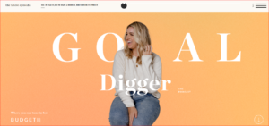
Flat design is a popular web design trend that emphasizes simplicity and minimalism. Flat design typically uses minimalistic layout, typography, and iconography to create a clean, modern look. Many web designers believe that flat design is more user-friendly and easier to navigate than traditional designs.
Grid-Based Layout
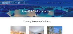
One of the most popular trends in web design right now is the grid-based layout. This type of layout is characterized by a series of evenly spaced columns, which can be used to organize content in a clean and efficient way.
There are a few things to keep in mind if you’re considering using a grid-based layout for your website. First, make sure that the content you want to display will fit neatly into the columns. If you have a lot of text or images, you may want to consider using a wider column width. Second, use contrasting colors for your columns to make them easy to distinguish from one another. And finally, make sure that your grid-based layout doesn’t become too cluttered – leave some white space around your content to avoid making your website look too busy.
Conclusion
There are a lot of different website design ideas out there, and it can be tough to decide which one is right for you. Hopefully this article has given you some inspiration and helped you narrow down your options. Remember to keep your audience in mind when making your decision, and choose a design that will appeal to them. With a little bit of planning, you can end up with a website that looks great and helps you achieve your business goals.
