Taking your message to your clients…
Read Why Advertising in a Bad Economy Is Good

Like the rest of the country, companies of all sizes in Reno are struggling to cope with the new reality of doing “business as unusual!”. They can no longer take customers and clients for granted. Business owners know that, even when things return to the semblance of what they were, regular customers might not return in the same volume as before.
That’s the underlying challenge that PR firms and advertising companies are working to help over come for their clients today.

Digital Age Advertising Service Menu
Businesses need customers. We know where to find them.
Whether it’s a wholesaler, retailer or service-based business, you rely on having a steady, predictable flow of customers for your products and services.
This is a digital age, and everyone that’s in the advertising or digital marketing business understands that. So, as an advertising company, what value can you add to your client’s businesses? Well, one thing’s for certain: The old school approach, of running ads in the community newspaper, or posting flyers in malls and shopping centers, won’t work in a digital era. But in today’s digital world, there’s plenty of value-add that advertising service providers may offer to local Reno businesses:
From creating stand-alone digital ads, to knitting those ads into cohesive advertising campaigns for their clients. Advertising companies are great at visualizing online themes that clients and consumers are looking for; and then building marketing campaigns around them.
Obviously, to do that, advertising companies must have an online presence of their own. And for that, your first step is to establish a robust website where you showcase your own prowess for clients and prospects to see.
Your clients want to ensure they offer the best products and services they can to their customers. But today’s digital era means they (your clients) are competing against many other competitors online, than just bricks-and-mortar stores. They’re also up against rapidly changing customer tastes. They’re dealing with new ways to advertise and market their offerings.
In these circumstances, advertising companies can research the competition, the marketplace and evolving consumer trends, and deliver a slew of data-driven marketing ideas to their clients.
The online marketplace is fiercely competitive – more so than the competition traditional in-store businesses face today. As a result, clients of advertising companies need help to differentiate what they have to offer, versus what their competitors are offering. Unless your clients demonstrably show why customers should opt to choose them (versus their industry peers), it’s unlikely they’ll beat the competition!
And that’s yet another value-add that advertising companies can offer their clients. By using digital branding strategies, you not only highlight your clients as the segment leader; but you can also use similar strategies to position your company as the advertising specialist in the client’s niche.
As an advertising company, clients typically turn to you when they have questions about ad-spend. Which advertising channel should they spend their marketing dollars on? How much should they spend on each strategy? Which advertising medium should they choose to get the greatest bang for their buck?
All these questions effectively translate to the oft overlooked question about the cost effectiveness of advertising budgets. Because digital advertising is the way of the future (and very much the present too!), as an advertising company, you can deliver superior value to clients by offering insights into cost-effective digital advertising strategies.
Advertising Agency Resources
Clearly, advertising companies have a lot to offer local Reno businesses. But, as a Reno advertising agency, you’re not alone in helping clients make the most of your business, and the services you can potentially offer to support them. The resources at your disposal include advertising industry associations, staffing and human resource support groups, government trade and industry agencies, and many other institutions and organizations dedicated to providing the resources you and your clients might benefit from.
Some of the resources you should consider leveraging include:
- The Reno Chamber of Commerce is a great place to turn to when you are looking for help and guidance related to trade and economic developments within the Reno-Sparks area. With over 1,700 full-time members, the Chamber represents the interests of more than 10,000+ businesses, from a cross-segment of industries, in the Reno-Sparks region. As an advertising company, you too could be the beneficiary of the over 4-million-plus referrals the Chamber makes for member services
- If you are an advertising company specifically focused on a unique business segment, such as Banking, Mining or Builders and Construction, then the Chamber has industry-specific resources and associations that you might be able to leverage.
- Not in the advertising business too long, or looking to receive industry certification for your advertising or marketing business? Well, there’s no better resource to turn to than the Nevada Business Advisors. Alternately, tap into the resources offered by the Nevada Department of Business & Industry to receive help and support on certification
- And while you are at it, why not become a member of the Nevada Government eMarketplace (NGEM). Through one central portal, you’ll be able to access business opportunities from thousands of participating companies at the marketplace. As a business development resource, NGEM is priceless!
- When looking for inspiration and direction on delivering superior advertising services to clients, the American Advertising Federation of Reno (AAF Reno) is a great local resource to tap into
- Depending on where your advertising company operates in Reno, you might also find some excellent marketing support from the Reno-Tahoe chapter of the American Marketing Association (Reno-Tahoe AMA)
- Stay connected with, or get involved with programs and events hosted or sponsored by the Economic Development Authority of Western Nevada (EDAWN), to capitalize on local marketing and advertising opportunities
- If your advertising clients represent specific segments of the local economy, you must associate with specialist agencies and associations that represent businesses in that niche. Tap into resources offered by organizations like the Reno-Sparks Association of Realtors (RSAR) or the Reno-Sparks Convention and Visitors Authority (RSCVA)
- A great way to continually develop the skills and talents of your own staff, and those of your client’s, is to take advantage of all the support that the Northern Nevada Human Resources Association (NNHRA) has to offer
- Every business needs some form of advice and support, especially during the formative years. The Nevada Governor’s Office of Economic Development (GOED) offers a number of resources that advertising companies may tap into
Some entries, in the collection of resources mentioned here, are marketing and advertisement agency specific, while others may be resources for the broader business community – including marketers and advertising companies. The point of mentioning them here is to underscore the fact that, as an advertising entity helping clients make the best of their advertising strategies, you have many resources that you can tap into. As well, as a value-added service to your clients, you could also direct them to leverage these resources.
So, what specific resources and services might advertising companies hope to tap into through these organizations? Well, the range of benefits are very broad, and could include preferential financing terms, best practices, networking, clarity on industry rules and guidelines, lobbying for legislative improvements in the advertising industry – and a lot more.
If you are specifically looking to take your business online, or if you believe your clients might benefit from digital marketing, then RenoWebdesigner can help. We can help you understand critical-to-success aspects of your online marketing strategy, including how your business ranks online, where the significant portion of your web traffic comes from, and what keywords in online searches are the most profitable for your business.
The Advertising Agent’s Online Toolkit
As an advertising business, you owe it to yourself and your clients to arm yourself with an array of services in your toolkit. These tools are what you’ll unleash when clients ask you to help them get ahead of their competitors. And appropriately enough, the tools you need to compete against your own competitors are the same toolset your customers and prospective clients are looking for.
More specifically, your digital toolkit must include skills, tools and techniques to help clients in:
The days of sealing and mailing individual envelopes with your marketing message are long gone! Today, online advertising campaigns, like Pay-per-Click (PPC) and email marketing reach a much broader audience than snail mail does. Advertising agency clients look to their service provider to help them with digital mass messaging.
Your website is a powerful tool that you can use to promote loyalty within your client base. However, if clients visit the site and see something “plain” and “uninspiring”, it’ll do anything else but promote loyalty in you! Having a professional web presence is key to instilling customer loyalty!
One of the main goals of any advertising company is to help clients gain the confidence of their clients. However, to do that, clients must first have confidence in the agency (you!) that’ll help them build client confidence. By promoting your own services online, through blogs, articles, opinion pieces, and other confidence-instilling strategies, you’ll ensure that clients have confidence in your ability to deliver what they are looking for.
Making strategic use of social platforms, like Facebook, Instagram and Pinterest, advertising companies can tap into a vast network of professional associates to further their business objectives. However, to do so, you need to establish a well-designed social networking profile of your own. It is only then that you can help your clients tap into their own social presences to market and advertise their own services.
A crucial arrow in any advertising companies quiver is their brand. Having an online branding strategy is very important for any advertising company, because that’s what sells. By engaging in online advertising, promotional campaigns and content marketing activities, you can ensure that prospective clients (and existing customers) know and recognize your brand.
As a local Reno advertising company, one of your objectives must be to help promote your clients beyond just the local market. And relying on old-school tricks and techniques to do that won’t cut it anymore – not in today’s digital world. You therefore need to band together all the above tools, into a single unified online marketing strategy of your own, to position yourself to support clients make their presences felt beyond Reno.
Taking Your Business Digital
Taking your business online, and establishing a robust, professional digital presence is the best way to showcase your own business. And it can be a way to attracts clients, and prospects, looking for professional assistance with their own advertising strategies. Reno advertising companies provide invaluable services to their clients, especially in today’s new age of digital marketing and advertising.
From digital advertising campaigns to social media marketing; and from SEO to PPC marketing, it pays to position yourself as a full-service digital advising service provider. However, if you aren’t a digitally-savvy advertising company – no problem! Work with RenoWebdesigner to not only create a powerful online presence of your own, but also to provide value-added digital advertising and marketing services to your clients.
How might we collaborate to unleash the power of digital advertising and marketing, both for you and your clients? Through a combination of advisory, consulting and web services, including:
- Web Design
- Web Development
- Digital Marketing
- Pay-Per-Click (PPC) Marketing
- Social Media Marketing (SMM)
- Search Engine Marketing (SEM)
- Search Engine Optimization (SEO)
- Brand and Reputation Management
- …and a whole lot more!
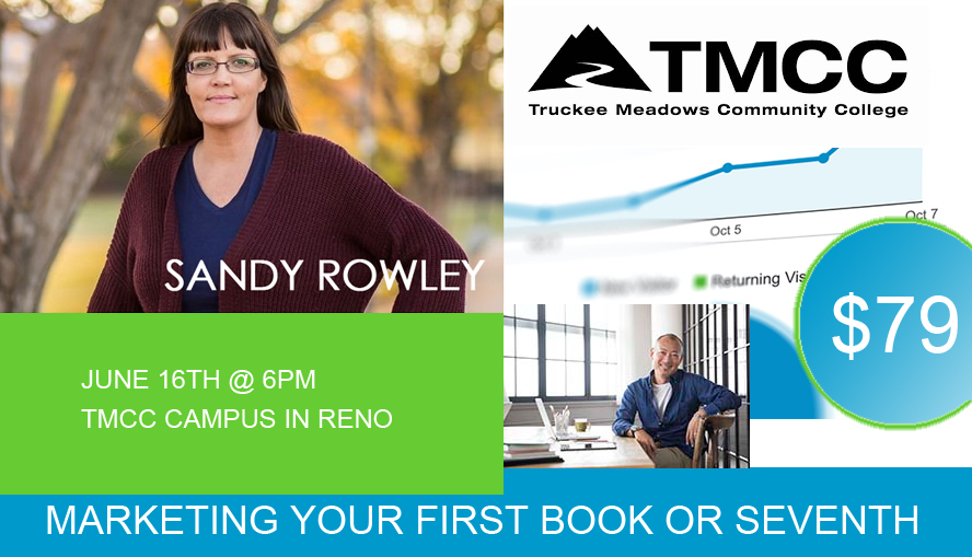
Reno advertising companies have yet another powerful local resource they can tap into to learn more about how they can transform their business in today’s world of digital marketing and online advertising. Join Sandy Rowley, one of Reno’s leading online marketing experts, each month for a FREE marketing workshop.


