Feb 20, 2020 | Web Design, web design reno

So many of us do a Google search for a term, sentence or word, and then scroll through dozens (if not hundreds!) or search results. We’ll effortlessly browse through any number of web sites to find just what we need – from the comfort of our (mobile) homes, offices and hotel rooms. But how many of us stop to think: Who are the people that make such ease and comfort possible?
More than just pretty web pages!
The answer: It’s web design companies!
According to an industry report published by research firm IBIS World, the 75,531 businesses in the web design industry, across the U.S., employ over 144,549 professionals. In 2019 alone, the industry generated over $38 billion in revenue. So, what does that mean in “real” terms:
- More jobs
- More taxes
- More growth to the nation’s economy
- More addition to the country’s GDP numbers
That’s a lot of “mores” coming from an industry that works largely behind the scenes! As an industry, web designing service providers do more – much more – than just create beautiful web pages. A look at just a tiny fraction of what they do gives an insight to how invaluable they truly are to individuals, businesses and community institutions:
- Graphic design
- Interface design
- User experience design
- Search engine optimization
- Content development
- Coding
- …and a lot more
The impact of web design companies is especially important for businesses and communities in smaller population centers like Reno, NV. As Reno emerged from its image as a center for the entertainment and gaming industry, it quietly acquired the skills and expertise to deliver high-tech services to businesses locally and afar.
Putting Reno on the world stage
It might sound like an “over statement”, but it really is the truth – local web design companies in Reno do a lot to shine a global spotlight on the city. And the reason is simple math: A small number of highly talented individuals get more recognition than a vast pool of resources that drown in an even bigger ocean of talent.
In larger population centers, there are hundreds of web design companies that compete for business from thousands of businesses and community organizations. The much larger economies of their regions hardly feel the impact of what they do. But in less populated centers (compared to, say, the Big Apple or the Sunshine State) like the Biggest Little City in the World, the efforts of web design companies:
- Puts Reno businesses on the global map
- Enables the city’s businesses to create supply chains spanning the nation and even internationally by facilitating eCommerce
- Allows Reno residents and communities access to products and services nationwide and even globally
- Empowers Reno businesses and communities with the ability to conduct transactions 24×7, on-the-go by supporting mobile web service providers
Even the slightest achievement on the part of Reno’s web designing companies, goes a long way to adding to the competitiveness of local businesses. And to make their impact felt, Reno web designers must be good – perhaps even better than their peers in large cities – at what they do. And they are!
Reno web design companies are second to none when it comes to providing local businesses with solutions based on leading-edge web technologies either. Whether it’s an Magento-based eStore, a dynamic Drupal website designed for heavy traffic, a personalized WordPress website, a high-performance Shopify store front or a SharePoint-based ecosystem – you’ll find the expertise at a local Reno web design company.
Make the most of your website
Reno Web Designer’s Webby Award-winning founder and “designer-in-chief”, Sandy Rowley, brings the power of high-quality web sites and puts it in the hands of businesses and communities across Reno – and even beyond. Whether it’s a personal website, a corporate online presence, or an online global B-2-B portal that you’re looking for, Sandy can help you with your vision.
You can call or text Sandy Rowley @ 775-870-0488 to learn how your business or community organization can reap the benefits of high-quality web design services, provided right here in Reno.

Jan 8, 2020 | Website Design Reno

When you start looking into getting a new website, you may find yourself a bit overwhelmed with all the new and unfamiliar terminology. Isn’t it all just web design? But then what is UX design? What about UI design? Are they similar? And what are the differences between them?
The truth is that they can seem very alike, especially when you don’t know a lot about the technical side of putting a website together. UX design and UI design indeed pertain to the same area of design – but they are two very different halves of the same final product.
In the simplest terms, UX design is responsible for “user experience”, while UI design is responsible for “user interface”. That is to say, the former has everything to do with the way a user experiences your site and the latter is related to what a user sees, how the site is presented, and how the user interacts with it.
When creating a website, you need to learn about each of them and be aware of the differences. That will ensure you receive a final product that is of the highest quality, from every point of view. Both user experience and user interface are important aspects of the website, so let’s learn a bit about each and the differences between them.
What is UX design?
User experience means virtually everything that pertains to the way a user experiences your product (i.e. website). Indeed, UX is not limited to the digital world; in fact, the term was not coined concerning digital products at all. UX design is necessary for any product a company puts out because it’s the part of the process that focuses on the way a user interacts with your product, whatever that may be.
You can work on UX design for a website, a toy, or for a coffee cup – the important part is figuring out how the user is going to make practical use of the product and to make it as intuitive and simple for them as possible.
In the case of building a website, user experience means virtually everything that pertains to the way a user experiences your product (i.e. website). That includes all aspects of the way they interact with your site, from adding a product to their cart, for example, to checking out.
Your user experience on the website is really dictated by a very intentional and well-thought-out design. Have you ever visited a website that is not at all user-oriented, where actions are not intuitive, and that’s difficult to navigate? Have you thought “who the heck designed this?!”. That’s a website that skipped over UX design or just didn’t give it much thought. And you can tell.
It’s a lesson, in a way – when designing a website, think about what you want to convey, but also think about who is going to be using it. There are a few questions you should be asking yourself:
- Who is going to use my website?
- How are they going to use it?
- What are they looking for?
- What are the most important actions to perform?
What is UI design?
UI design refers to the design behind the user interface, where the user interface is the point where the user interacts with the digital product (i.e. your website). UI design concerns itself with the way the product looks to the user, and the way it interacts with them.
Whereas the UX designer creates the “skeleton”, or the foundation of the website, the UI designer is in charge of all the details that bring the vision to life.
That means that every single action or point of interaction must be carefully thought out and designed in a way that will be as intuitive and as user-friendly as possible. That includes things like color themes, images, fonts & typography, spacing, buttons the user may interact with, and icons.
That’s because, in essence, it is the UI designer’s responsibility to create an intuitive, attractive, and friendly experience for the users targeted by the digital product – in this case, your website. The goal is for your user to not have to do much thinking, when navigating your website.
You want everything to come naturally and for someone to be able to access your website easily and find what they are looking for. A good UI design essentially guides the user through the website and helps them find what they need, whether that’s information about your company or purchasing your products. The better your UI design is, the easier it will be for someone to navigate your website.
What are the most important differences?
The differences are already obvious and emergent, but the most important is the fact that they are in charge of different aspects of your site. UX is all about the behind-the-scenes, unseen aspects that enable the overall user experience of the website and the feel of it. UI is about function and visual design; the way your website looks.
Equally important is the fact that they work together. They are both essential. UX can be seen as the necessary “internal” makeup of the product, if you will, while UI is the external, visible makeup. Like any other machinery or even the human body. The user will benefit from UX design just as much as they do UI design. They don’t always see the work that goes into the website, but their overall experience is enhanced by both types of design.
The other thing to remember is that to create either type of design, you don’t need to be a master of the other. A designer that does UX doesn’t necessarily need to also do UI, and the other way around. They do need to have an in-depth and global understanding of the way they work together, and their function.
Which one is the most important?
Ha! – that’s a trick question! UI and UX are two halves of the same final product. There cannot be a hierarchy, because they are both equally important. It makes sense, as you cannot have one without the other. Which one can you sacrifice? The basic user functions of your website? The way your site looks?
If you’re having a website made, you need to hire both a UX and a UI designer. Yes, some people who dabble in both, but it’s best to hire a team who will be able to give you the quality you expect. You can hire freelance designers online, or you can find a company that does both. That way, your website will be a cohesive final product and both sides will be catered to equally.
In what way do they work together?
As we mentioned, both UX design and UI design are completely essential to a beautiful and well-functioning website. And trust us, if one half is missing or haphazardly done, you can tell. You can have a website that has low-quality UX, but great UI, and the other way around, and they will result in two different, but equally frustrating experiences: a website that looks good, but works terribly, or one that looks terrible, but works well.
Ideally, you want both to be in top shape because that is going to give you the complete, high-quality website experience you are seeking to create for your users. You see, UX design and UI design must be complementary, above all else. Just like any other great partnership, their strengths work together to create the best possible version of your website: one that looks sleek and is easy to use.
What’s the bottom line?
As you may have been able to figure out by now, UX design and UI design are both integral parts of your website. Far from being optional, UX and UI design are in charge of making your website a complete, functional, attractive experience for your users.
UX design and UI design need to co-exist for your digital product to be visually attractive, as well as intuitive and functional. A website without one or the other offers a frustrating experience where either the visual or functional aspect is lacking.
Jan 8, 2020 | social manager, social Marketing
https://www.pexels.com/photo/food-pizza-woman-beautiful-3326713/
Social media marketing is an investment no company can do without and it’s especially important for small and medium businesses, startups and entrepreneurs. Social media enables very simple and cost-effective two-way communication.
Using a smart digital marketing strategy, you can increase the audience reach of your posts. However, good design is what makes the audience stick around.
Social media platforms are still a necessary form of promotion and a great way to build your brand identity. With attractive social media ad design, your posts will be remembered, shared and liked.
Where do you start? How can you start redesigning your ad strategy in order to attract new followers and customers? In this article, we’re bringing you the 6 steps you can take to start to improve your SMM results instantly.
- Develop a Consistent Style Guide
Every major brand has a style guide. It’s a general brochure or a document that describes all major points and details related to design, such as logo, visual instructions, colors, font, etc.
Here is an example from L’oreal:
Image source: L’Oreal Brandbook
If you want to run an organized, successful social media campaign, you need to have consistent rules for posting content. The easiest way to achieve this is to develop an all-around design style guide and stick to it.
This will also help newcomers in your team. Instead of having a browse through hundreds of posts and question colleagues about the brand style, they can simply refer to the style guide and know exactly what to do.
Here are some of the most important sections that you should include in your design style guide:
- Font (typeface, color, size)
- Colors (with RGB code and a palette sample)
- Logo (attach a logo in all its possible forms, with explanations when to use which ones)
- Social media header images (for Facebook, LinkedIn, YouTube)
- Profile pictures for social media pages
- Photography guide (where to acquire photos and how to attribute sources)
- Step-by-step social post (if you make your posts in an online tool or Illustrator, attach a template with step-by-step instructions for a generic SM post)
- Write High-Quality Ad Copy
When it comes to social media ads, visuals are extremely important, but that does not mean you should ignore the text.
Words have the power to influence behavior, trigger emotions, motivate and inspire, which makes them the perfect tool for social media ads. When you look at major corporations and brands, you will see that they pay very close attention to what kind of wording they use, especially with marketing-friendly buzzwords.
Here, you can find the best writing websites to help you hire professional writers for your ad copy. It’s always wise to hire or at least consult with a copywriting expert before posting something.
- Tailor Your Design to Your Audience
Does your audience respond to your visuals? Do you know what your customers and clients like?
As you probably know, each color, typeface, form and layout has a specific effect and every audience has its own preferences. For example, if you’re running B2B marketing campaigns where you’re targeting top executives, you would use black or blue with a clean and sleek design.
On the other hand, marketing to teenagers is a whole other pair of shoes. In order to reach them and be engaging in their colorful newsfeed, you need to pop. This means colorful visuals, high contrasts and “loud”, impactful fonts.
- Test and Experiment
This is one of the most important parts of your social media ad design strategy.
Many designers and marketers believe that perfect content nails it on the first try, and is a result of careful pre-thinking and preparation. Of course, even though every post should be well-thought-out and planned, you can only know so much before actually posting it.
One of the best ways to test your ad design is A/B testing or multivariate testing. Design two different ads and see which one performs better (you can easily track this with Ad Manager).
- Consider Rebranding (if necessary)
If your ad content is constantly underperforming on social media, maybe it’s time for a design overhaul.
Of course, this can be a tricky step and it will require alignment and consultation with your entire time, coupled with weeks of hard work.
Also, redesigns changes become harder the more audience you have and the bigger your brand is. Just remember the public outcry every time Facebook had a redesign! However, there’s a very good reason even some of the most popular brands go through design overhauls. If something is not working at its best, it’s better to turn a new leaf and start from scratch than to flog a dead horse.
After it’s all done, refer to chapter 4 again (testing and experimenting). Before launching any kind of design, try finding a focus group which will test how they like the new design compared to the old one.
- Be Unique and Surprise Your Audience
On social media, there are many posts that look alike nowadays. Marketers are using tried-out, famous methods for attracting customers, but the problem is that they are among millions of others who are doing the same thing!
When you’re coming up with a new campaign, try thinking outside of the box. Even though you should track industry advice, you don’t have to follow an exact formula for a successful ad. If you’re completely original and unique, it will speak volumes about the awesomeness of your brand.
An example of unique content would be an uncommon format. These days, we’re seeing a lot of promotional videos combined with emoji-stuffed captions. Yes, that works. But yes, that’s all over the place.
Instead of a video, try posting a gif. GIF animations are among the most beloved format for millennials, who make up the majority of Internet users.
Conclusion
Developing the optimal social media ad design doesn’t have to be a nuisance. With the help of experts from different teams (copywriters, designers, marketers), your next viral post is bound to happen!
Nov 22, 2019 | Web Designer Near Me
The one-page website has created quite a fuss in the world of web design. For some, it may have seemed absurd at first, but this trend has proved to be very effective. One-page websites are functional, simple, and attractive. We also can’t forget that they don’t need the connection of payment gateways or other advanced features and they are relatively cheap. What more can you ask from a website?
The challenging part of one-page websites is that they need to be unique and attention-grabbing. You only have one page to wow the users and retain their attention. If you want to know how to create an awesome one-page website that’ll get you on the map of the Internet and its users, check out these actionable tips.
1. Plan out the Content
Considering that one-page websites shouldn’t overwhelm the users with endless scrolling page, you need to determine the most important information.
Start your process by laying out the website’s elements. Think about which information is of real value for the users. Your initial plans might contain some extra information that you can omit so take a close look at what you need and what you can exclude.
Discuss with your team which content elements are a must and that should be your base. Keep in mind that the page mustn’t be too long because the users will get bored before they check out the whole website.
2. Have a Hierarchical Layout
The content on a one-page website is presented on one scrolling page. Unlike multiple-page websites where information is distributed based on categories, one-page websites have all the information laid out at once.
Because of that, you need to find a way to organize the information effectively. A hierarchical order should follow the relevancy of information. One of the potential ways of distributing the information is:
- About section
- Your offering (services and products)
- CTA
- Meet the team
- Testimonials
- FAQ section
- A photo gallery
- Contact information
Of course, the order of information should be adapted to your services and your target audience.
Prioritizing the order of the information is one of the key steps and it demands extra attention.
3. Choose a Template
Templates can really simplify the website creation. They will lead you through the creation process and make sure that you don’t omit any important element.
In the template, you’ll already have strips and columns, a header, a rich footer, a social bar, and everything else that you need.
Most templates are fully customizable so you’ll be able to adapt the one you choose to your needs. You will have some basic elements as a basis but you’ll still be able to express your creativity and make the website unique.
4. Divide the Content with Strips
Since you don’t have different pages to organize the content, you can use the strips to achieve the categorization effect.
The strips can be added or removed until you get the desired effect. Organize them in the order that presents your content in the best light.
You can add images or videos to a strip to make the content stand out.
If you work with a template you’ll have pre-designed strips so you’ll only need to customize them and adapt them to your content.
5. Stand out with a Great Design
There is one simple rule you just need to follow: your design needs to rock!
A boring, generic, and repetitive one-page website just doesn’t stand a chance. That means that you need to go all out and create something awesome.
“Unusual and unique design will definitely give you some bonus points with the users. You can experiment with different backgrounds, scrolling effects, impressive text, or anything that comes to your mind. Be daring and explore different possibilities,” advises Julia Harold, the head of the marketing department at WowGrade.
Rather than crowding your website with text, use effective design and visuals to emphasize the most important information. This is the moment when your creativity should take over.
6. Make the Navigation Clear
Website owners who opt for one-page websites often include links to external pages. For example, a singer can have a link to the Spotify profile.
The external links can lead the users to an external payment platform, a YouTube account, or a different website.
This step is completely understandable, but what you need to be careful about is letting the users know that they are being redirected.
The users have the right to know that they’ll be led to an external page. They should also know why that different platform is useful for them. In that way, you’ll avoid confusing and wrong assumptions.
7. Stick to the Point
One-page websites are the perfect choice for those who don’t have a ton of content. That means that you shouldn’t beat around the bush and add a lot of fluff to mask it.
Your aim should be to keep it straightforward and simple. Don’t add unnecessary information just to make the page longer.
Stick to the point and provide users with the most important information, that’s all that you should focus on. No empty words, no inventing, no irrelevant information. All you need is to be direct and keep it as simple as possible.
8. Experiment with Parallax Scrolling
Parallax scrolling is a web design trend that can bring your page to life.
As the user scrolls down your website the layers in the background and foreground will move at different paces. Achieve this parallax effect by adding subtle animations such as reveal, zoom in, and fade in your editor.
By adding this 3D illusion to your website you’ll make it more interesting to the users.
The one-page websites are one dimensional and can seem boring to some. A trick such as this one can retain their attention and encourage them to keep scrolling till the end of the page.
Final Thoughts
With intuitive scrolling, sleek design, and direct content, your one-page website can be a huge hit. The simplicity and high-quality content are the way to reach the users’ hearts. As long as you follow these tips you’ll have clear guidelines that will lead you to the website of your dreams. Just remember that the users should always come first so create each element with a user-centric approach.
Angela Baker is a self-driven specialist who is currently working as a freelance writer at SupremeDissertations and as an editor at PicktheWriter. She is always trying to improve herself and her blogging career. Angela is always seeking to discover new ways for personal and professional growth and is convinced that it’s always important to broaden horizons. That’s why Angela develops and improves her skills throughout the writing process to help to inspire people. Also, she writes for LiveInspiredMagazine, rounding out her professional writing career.
Nov 7, 2019 | Web Design
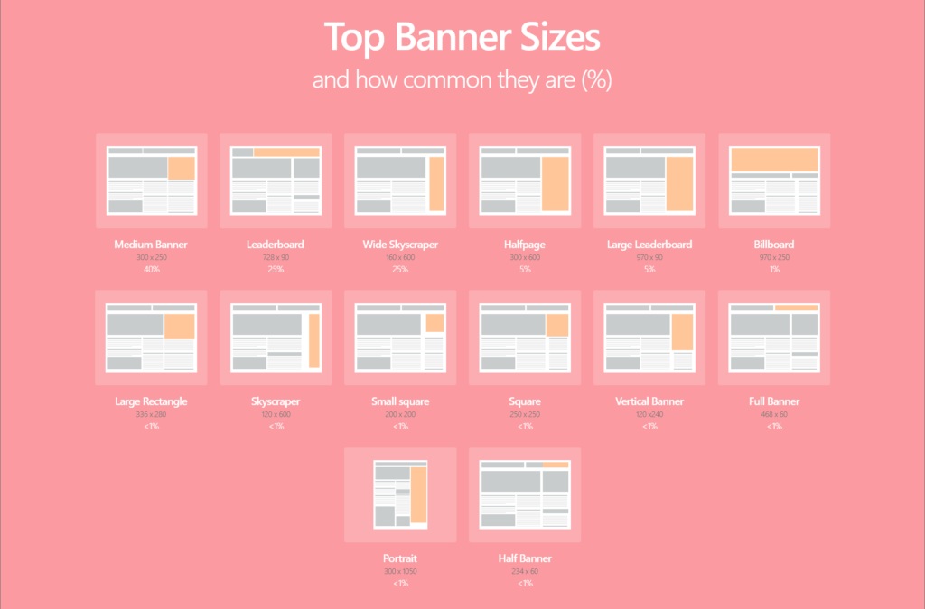
Top Banner Sizes: The 21 Most Effective Banners 2019
source: https://www.match2one.com/blog/standard-banner-sizes/
When creating banners for Display Advertising it’s important to consider which sizes to use. Choosing the right size of banner can greatly help you boost your advertising effectiveness.
To help you out we’ve collected data from 4.8 billion ad impressions on millions of sites to bring you the most up to date statistics on banner usage for 2018.
If you want to know which banners are the most commonly used across the web, this guide is for you.
The top Banner Sizes sorted by how frequently they’re used
Common Web Banner Sizes
The Interactive Advertising Bureau (IAB) has created standardized guidelines on banner sizes, which work across all advertising networks, including the Google Display Network (GDN).
If you want to learn more about the different sizes and how common they are, you will find the 15 most important formats in a handy chart below – together with how common they are, to make it easier for you to plan your campaign.
Download PDF guide with images here: